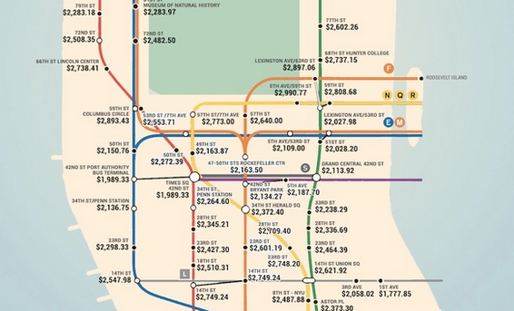
A map of average rent prices per subway stop in New York.

Anyone who has ever lived in NYC knows that rent is a serious issue here. In New York, it isn’t inappropriate to ask someone what they pay in rent upon first meeting them, it isn’t uncommon for you to have to move to a different borough when the rent rises even though you have lived in the apartment for five years, and it isn’t likely to change any time soon since every year, thousands of fresh new faces flock here to follow their dreams and jack up the rent even further.
READ MORE: Vintage Photos of the New York Subway
There isn’t much we can do about the rent situation, but what we can do is compare our rents with each other. This map represents the average rent prices based on the subway stop where you live. It is based on cost per bedroom, which is exciting for me since my rent is actually $400 under according to these stats. Take a look, and see how your bedroom stacks up. If nothing else, it’ll give you something to bitch about at your next apartment party.


