
Loving the Pantone 2017 colors? Us too, so we whipped up a quick tutorial for wearing ’em on your face with elegance.
The colorful fortune tellers over at Pantone have done it again. They’ve put together the top ten colors that you’ll be seeing throughout Spring 2017, and we like them. We like Pantone 2017 a lot. They range from the not so surprising “Kale” to the slightly more out there colors like “Primrose Yellow.” Because we know you’ll be seeing these colors all over the fashion world in the upcoming months, we thought it would be fun to show you how you can wear the same colors with your makeup.

Pantone 2017 has picked the following colors: 17-4123 Niagara (medium denim blue), 13-0755 Primrose Yellow (bright yellow), 19-4045 Lapis Blue (rich cobalt blue), 17-1462 Flame (medium orange-red), 14-4620 Island Paradise (light blue-green), 13-1404 Pale Dogwood (light beige with a hint of pink), 15-0343 Greenery (light kelly green), 17-2034 Pink Yarrow (medium fuchsia pink), 18-0107 Kale (dark kale-green),14-1315 Hazelnut (light beige-brown).
It would look more than a little bonkers to try and work every single one of these colors into one makeup look, so I split the group into three.


The first look is very all-American. I paired the Pantone 2017 colors Lapis Blue and Flame by using the L’Oreal Silkissime Eyeliner in Cobalt Blue, and the Smashbox Always On Liquid Lipstick in Thrill Seeker. This is a look I personally wear all the time. I love matching the warm orange-red with the bright blue. It’s fun and colorful without looking like a kindergarten teacher.


The second look is monochrome using both of the green shades. This may not be one that you casually wear to go pick up groceries or something, but it’s a good one to have on hand especially leading up to Halloween. The Pantone 2017 colors I chose are Greenery and Kale that I matched up with the Urban Decay Razor Sharp Long Wear Liquid Eyeliner in Kush and Obsessive Compulsive Cosmetics Lip Tar Liquid Lipstick in Blackboard.


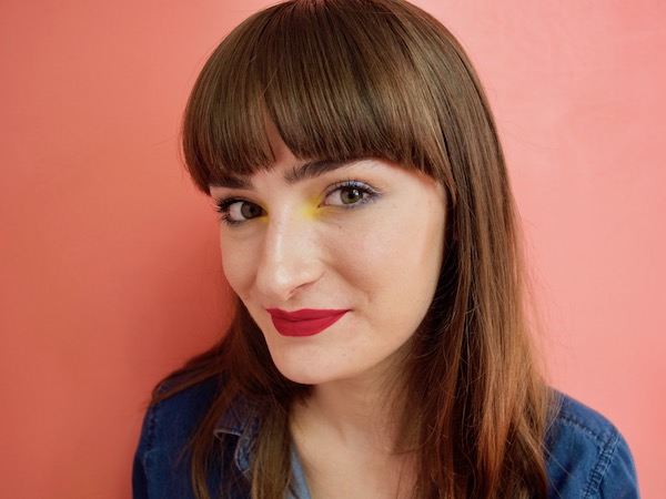
The last look uses all of the rest of the colors for a very bright result. The Pantone colors I mixed were Niagara, Primrose Yellow, Island Paradise, Pale Dogwood, Pink Yarrow, and Hazelnut. This look is a bit much so I’ll just list off the makeup colors I used in the same order as the Pantone colors before explaining how I used them — and remember you can always go big or go home with bright yellow candy corn nails if you’re still in the mood for autumnal goodness. Without further ado, YSL Full Metal Shadow in Wet Blue, MAC pigment in Primary Yellow, Colourpop Crème Gel Liner in Zulu, MAC Blanc Type, Kat Von D Everlasting Liquid Lipstick in Bauhau5, and Urban Decay Naked.

To get this very colorful look I started first on the lips with Kat Von D Bauhau5. This is actually one of my favorite lipstick colors of all time. On the eyes I did a wash of MAC Blanc Type all over the lids and blended Urban Decay Naked in the crease. In the upper and lower inner lash line I blended in ColourPop Zulu and blended that into the YSL Wet Blue on the outer corners. For the grand finale I used MAC Primary Yellow as my inner corner highlight.
Obviously you can pick and choose to only use one bright color at a time instead of using all the colors at once. Will you be wearing any of the Pantone 2017 colors this spring?
Love this article? For more beauty, style, travel, and trending topics check out The Luxury Spot on Facebook. Like us and we’ll love you back!